Tell us one thing- do you like surfing the internet? Well, if you do, you may not even realize how many landing pages you visit all the time. All the ads on Facebook and Instagram leading you to a specific page is what we call a landing page. It may or may not have a call-to-action button.
The sole purpose of a landing page is to convert a lead into a customer. But there can be a lot of confusion regarding a landing page. So, we have thought of making a descriptive guide- a blog about designing landing pages for better conversion.

What Is A Landing Page?
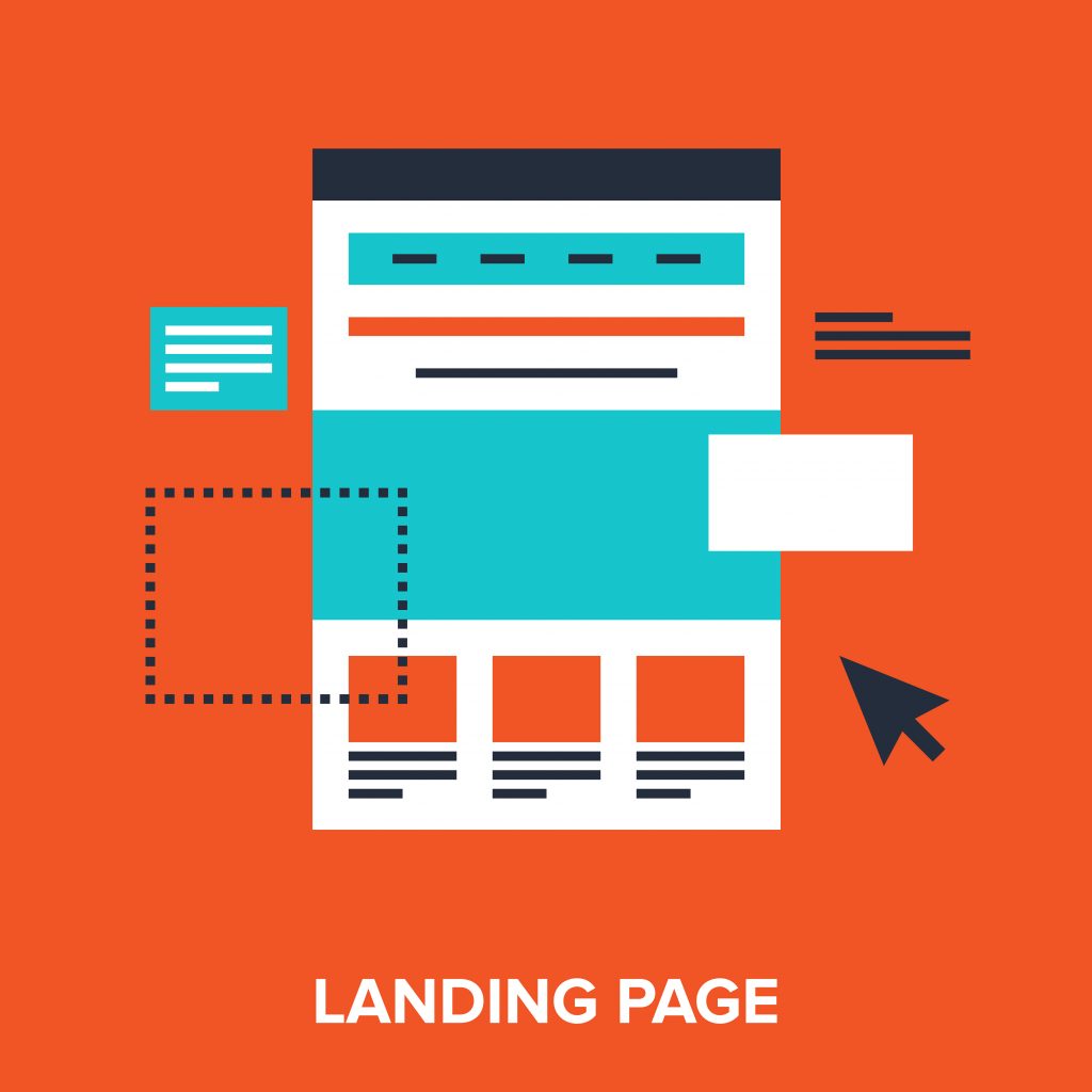
Let’s start this discussion by knowing what a landing page is. A landing page is a web page having a specific purpose. The main target behind a landing page is getting a proper lead conversion. There are different types of landing pages that you can use. But all these have one specific purpose.
It is called the “Landing” page because you land on this page after clicking any certain ads on Facebook, Google, or any other site. The desired action behind a landing page may vary. It can be filling out a form, buying a specific item, or signing up for some offer by entering your email address. In each case, a landing page increases the chance of converting leads into customers.
How to Design the Best Landing Page
Crack a Relevant Benefit-Specific Headline
Headlines are the most important part of a Landing page. It works as a hook. You only have 6 seconds to attract a lead. So, the very first headline of your landing page should be benefit-specific. It should be bold and clear, conveying directly what you are offering. In short, it should clearly depict what your landing page is about and what it offers.
Compelling Sub-headline
Do not underestimate the value of a subheading. According to Top Left Design, a sub-headline makes your reader read the whole content instead just of leaping from points to points. The sub-headline should have relevant information, collaborating with the headline. In that way, you can convey more information to the reader in the first go.
Choose Appealing and Relevant Images
Visual attractions attract more audiences than just words. Images play a very important role in landing pages. So, the image is mandatory and should be relevant to your offer. It should also represent the target audience. In landing pages, the purpose of using an image is to convey how your audience will feel after purchasing something.
Make Relevant Copy
Don’t just put all your effort into finding the best heading and finding images. Instead, focus on making a compelling copy. The words that you will choose should leave an intense effect on your readers. So, your copy should be clear and direct, while it also should have a conversational tone.
Choose the Right Tool
When it comes to conversion rate optimization, you should have the best tool. A wrong tool can negatively impact your result. There are plenty of landing page designing tools available. Almost any of those can do the work.
But, if you want better conversion, you will need effective ones. Tools like OptinMonster or Instapage are some of the best in the market, with lots of optimized templates.
Make It More Interactive
If you want better lead conversion, you have to make the landing page more interactive. If you have any knowledge about interactive content, you already know how prospering those are. You can use interactive calculators, personalized quizzes, and other interactive ways to hold potential. Check out Amplayfy for creating interactive content such the one’s mentioned prior with ready to use templates.
Give Away Relevant Information
In order to get anything, you have to give something. In this case, your offer is the thing you are giving away in exchange for someone’s personal information. So, don’t hold back on something.
For example, if you are writing a blog on “top 10 smartphones,” put as much relevant information as possible. After all, in the end, you will be asking them to buy from you only. You can also put your personal recommendations in the end.

Keep It Simple and Ask What You Want
Keep the landing page as clean and simple as possible. It should be visually attractive but also should be easy to consume. Likewise, ask only the details you need. Don’t use your potential to fill out a long-form, or they will lose interest. Go for a specific lead assessment with the most relevant details only.
Conclusion
Designing the best landing page is not child’s play. You need to invest your time, skill, resources and patience. These landing page design strategies will help you build a landing page for better conversion of leads. Lastly, don’t forget to add a thank you page in the end. Being polite with your leads leaves a positive impact on their mind.


